NerdWallet is an app for iOS and Android that gives you a bird's-eye-view of your finances, along with personalized recommendations to help you grow your money and reach your financial goals.
As finance apps were surging in popularity, it became increasingly clear to us how subpar NerdWallet’s app experience was. Additionally, our internal team dynamics were becoming more complex as more of the company’s resources were put toward mobile development. I helped assemble a small team with the goal of improving the app experience for our users, as well as our mobile development process.
Approach
We needed to take a phased approach to this project rather than designing everything at once, so I proposed a series of steps that helped us gradually reach our goal, while mitigating any negative impacts on the user experience along the way.
- Create an audit of existing styles, components, etc.
- Tackle ‘low hanging fruit’, like performance issues, visual bugs.
- Update our IA and navigation system.
- Start UX and visual design improvements on pages with the widest variety of components. Repeat until all pages are done, gradually filling out our design system in the process.
- Promote mobile-first design through presentations and consultations with other teams.
IA & Navigation
After tackling some low hanging fruit like performance issues and visual bugs, I started addressing some changes to the information architecture of the app. NerdWallet had recently made the decision to sunset a couple of features, so I worked closely with product leaders to modify the IA of the app to reflect the company’s new priorities, and promote the sections that kept users coming back to the app.
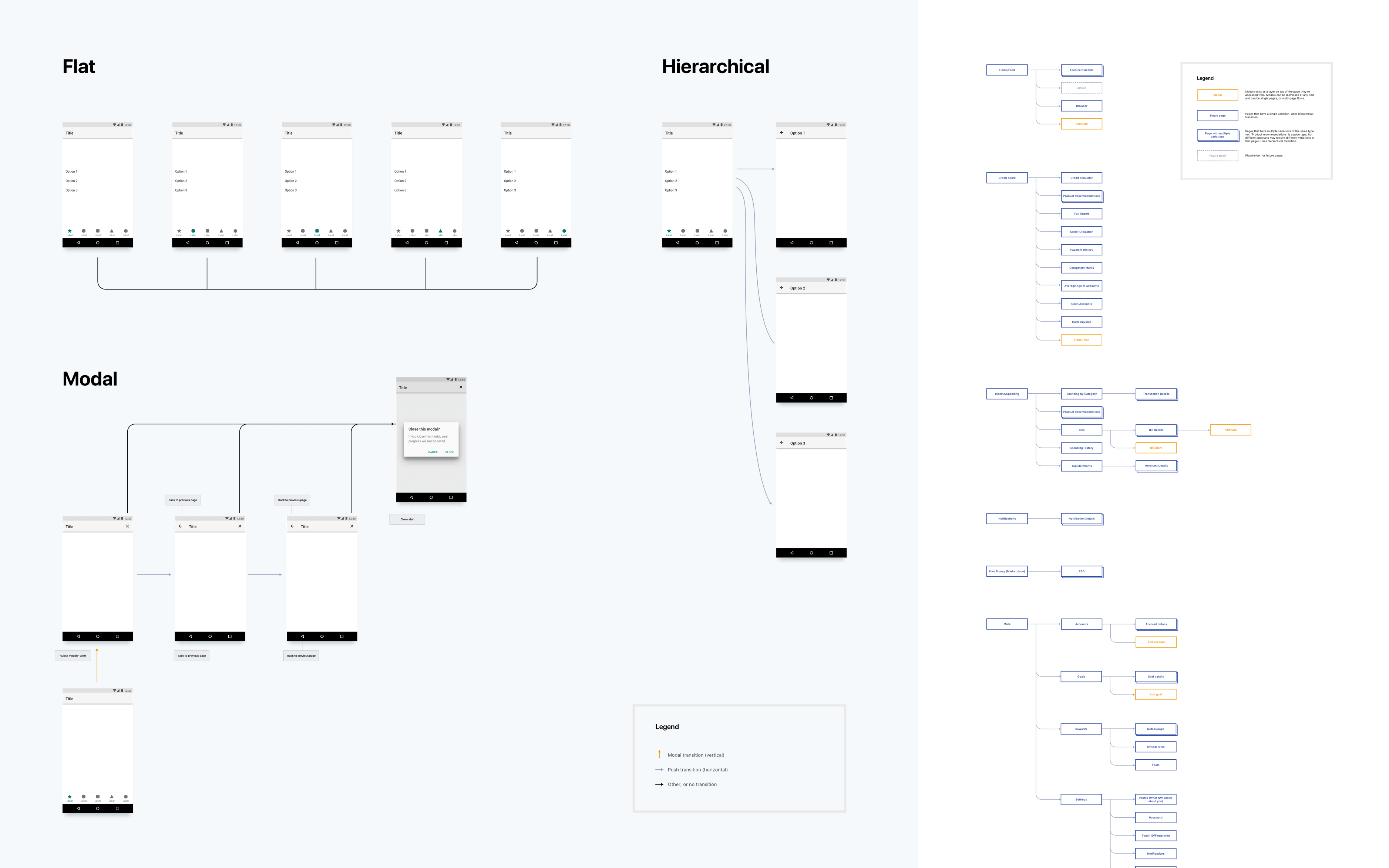
I also started addressing some foundational navigation issues. Some of which included users getting stuck in lengthy flows with no option to leave, a lack of consideration for Android’s back button, and general confusion about when to use a particular navigation style, just to name a few.
I created documentation along with a usable prototype that described 3 different navigation styles, each informed by platform-specific guidelines with minor adjustments to address NerdWallet’s specific needs, particularly around modal navigation. This let engineers plan accordingly by knowing what needed to be supported, and explained to designers when to use a particular navigation style.
Design System
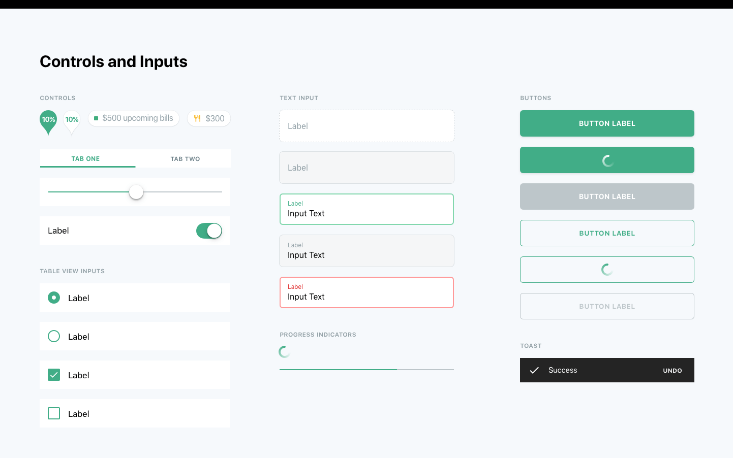
One of the outcomes of this project was our design system, which had a few primary goals:
- Improve user experience through a more familiar and consistent UI.
- Increase efficiency of product development through the reuse of components.
- Ease collaboration as more teams begin to contribute to the app.
- Help chip away at design and engineering debt.
Early on, we decided to start with a foundation of platform-specific conventions instead of a fully custom design library, and make modifications where necessary. Starting with this foundation gave users a sense of familiarity, and allowed us to leverage system capabilities like Dynamic Type and other accessibility features.
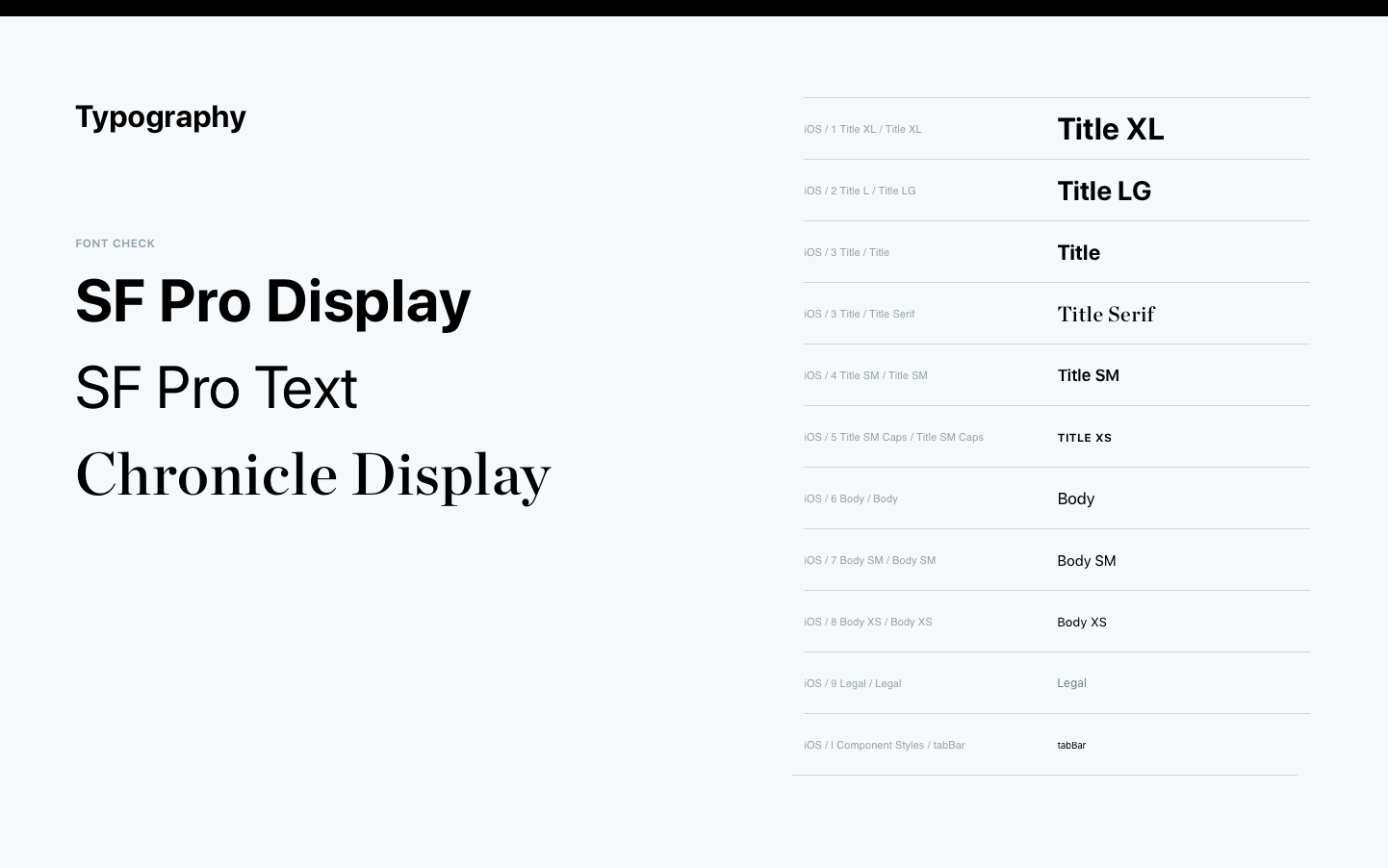
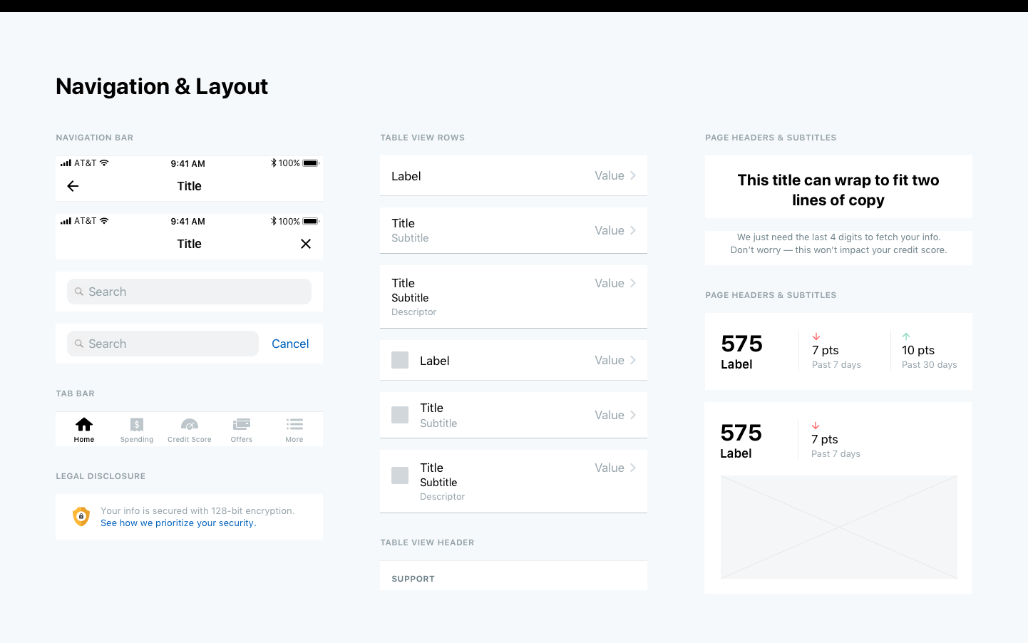
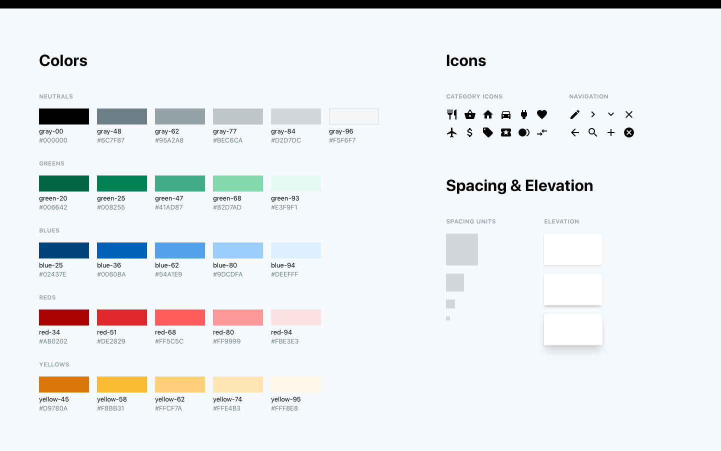
I used the Atomic Design Methodology, starting with base styles like typography, spacing units, and color as a foundation for basic components like buttons, cells, and navigation bars, which could then be used to construct larger components and layouts.
I started designing components in the context of the Home and Settings pages, while testing each component on other pages along the way. I chose these sections first because Settings had many common components like cells and switches, while the home page was very custom. Starting here allowed me to establish early on how far the design system should deviate from system styles.
Collaboration
While this new system proved very useful to many, some teams and individuals lacked experience with mobile development, and weren’t sure how to design with a mobile-first approach. Our team gave presentations to advocate for and popularize a mobile-first mindset across the company. I gave one such presentation to the design team, while also meeting with individuals on ways they could utilize our new design system for their mobile projects.
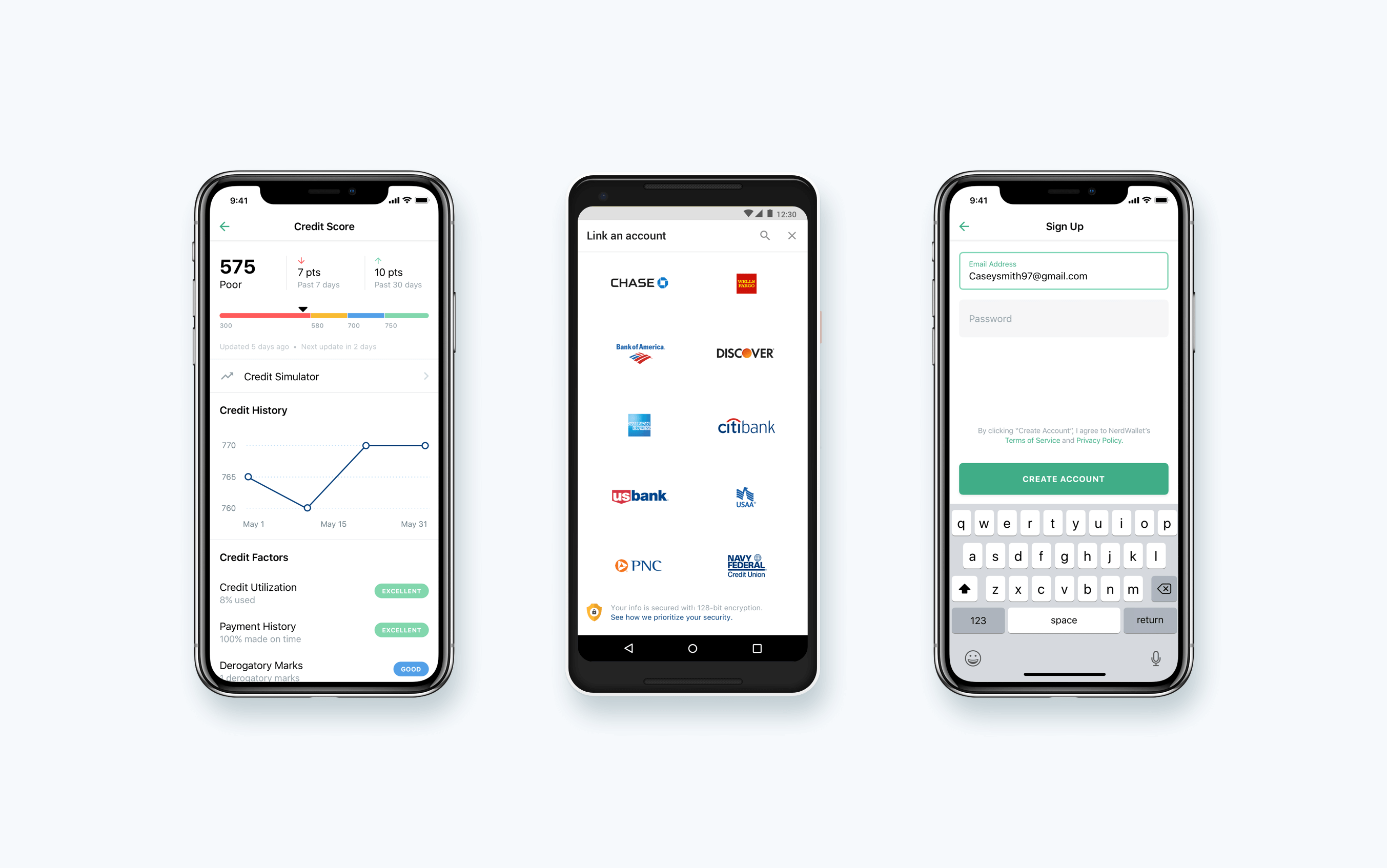
Design system in use on the credit dashboard (left), account linking (middle), and log in screens.
Outcome
We noticed a significant increase in the quality, consistency, and efficiency of other designer’s work. Kori, another designer at NerdWallet, was able to design a major feature of the app in just a couple of days - a process that would have normally taken at least a week.
- Over the course of the redesign, we saw an increase in our app store rating from 4.3 to 4.8, with specific reviews referring to the new design.
- Stability and performance were improved, greatly reducing the number of crashes users experienced.
- More teams began applying a mobile-first strategy to product development.
Reflections
I’m proud of the positive impact we were able to make, not just for our users, but for the company as well. Prior to this project, mobile was somewhat of an afterthought, and this project gave the company a significant shift in perspective.
Looking back, I think I could have done a better job documenting our design system. I think it resulted in a lot of unnecessary meetings and face-to-face walkthroughs that could have been avoided with better documentation.
The phased approach also made it harder to ensure a robust and scalable system, since sections were built one at a time. This also made for a number of awkward releases where only portions of the app were updated, while others portions still used the old design.
